Deployed model health
This article provides explanations of the metrics and ratings available when using Tealium Predict ML that help you understand the quality of your deployed models.
The Model Dashboard lists each deployed model in a list. Each row contains a snapshot of the prediction results for that model. To access the model dashboard view, navigate to Predict > Model Dashboard > Deployed Models.
A model overview may display the following information about a model:
- The recall of a model with indicators that show whether this metric has increased or decreased.
- A sparkline graph depicting the general performance trend of the model.
Strength ratings are recalculated automatically and the sparkline graph reflects live performance metrics.
- The version of the deployed model.

Evaluating the strength of deployed models
The model strength ratings provide a label for the quality of a version. There are two types of strength ratings, deployed and training. The deployed strength is an ongoing rating for each deployed model. The training strength is a static ratings for each trained version. For more information, see Strength scores.
Live model performance details
The deployed live performance score lets you understand the ongoing quality of your model and know when it has degraded, which inevitably happens over time.
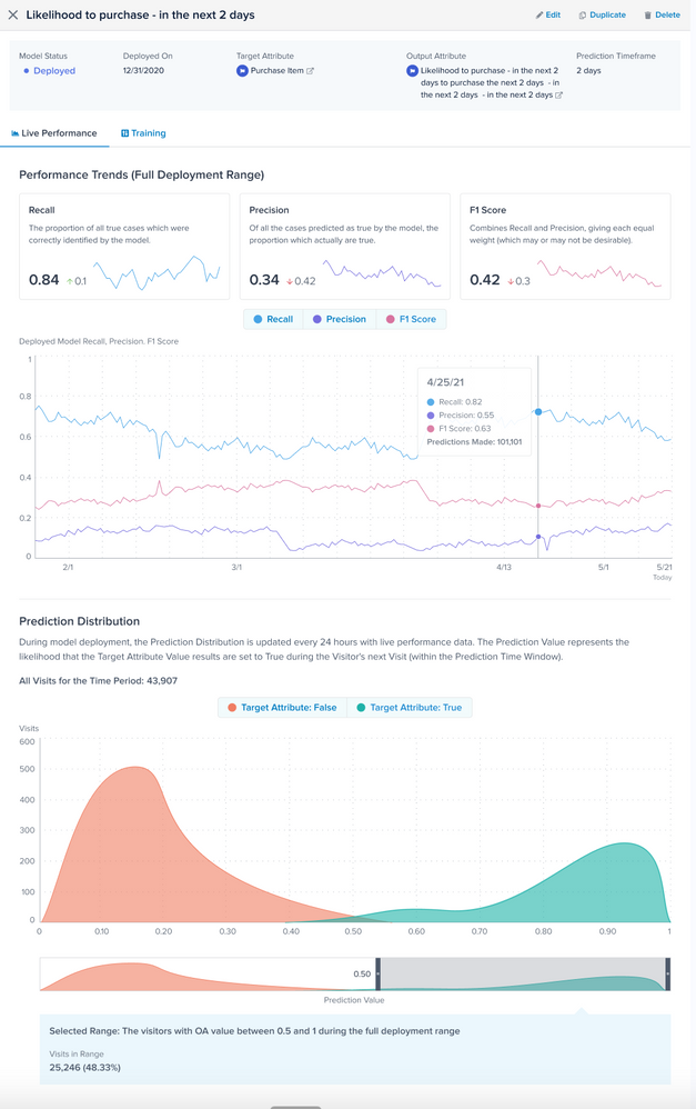
In Tealium Predict, the recall, precision, and F1 score are automatically recalculated daily for deployed models using the most recent time window available. This window is defined in the Prediction Timeframe, which equates to the number of days specified in the model as “in the next x days”. For the daily recalculation to begin, the model must be deployed for the initial Prediction Timeframe so that actual true/false results are known and can be used in the calculation. The calculation window then moves forward one day, every day.
On the Live Performance screen, the daily recall, precision, and F1 scores show you changes in model health over time. The Live Performance window also lets you explore the Prediction Value over the Prediction Timeframe using the Prediction Distribution chart. The Prediction Value represents the likelihood that the target attribute results are set to True during the Visitor’s next Visit within the Prediction Timeframe.

In the Prediction Distribution chart, the y-axis is the number of times the Target Attribute behavior was either True or False within the prediction timeframe, while the x-axis is the prediction value. Ideal results demonstrate True counts falling in the upper range of the prediction value (for example, above 0.5) and False counts falling in the lower range of the prediction value (for example, below 0.5). If the shape of the prediction distribution is similar to the probability distribution from the training model, it is an indicator of strong model health over time.
You can use live performance prediction distribution to help you decide thresholds for audience creation. For example, the Probability Distribution chart above shows most of the actual True counts in the range 0.75 to 1, so you can use 0.75 as a threshold to define an audience that are going to have a high likelihood of purchasing in the next two days. Similarly, you can define an audience below the 0.4 threshold as being less likely to purchase in the next two days.
Degradation and retraining
All machine learning models naturally degrade in quality over time, just as the real world continually changes. Models eventually stagnate and degrade in their ability to make accurate predictions about the changing environment. Therefore, models must be retrained periodically to ensure that they are based on the most current dataset available.
This page was last updated: June 25, 2025